Sydney-based studio Percept has designed the branding and packaging for Mizzica, a crema liqueur inspired by Sicilian traditions and developed for the Australian market.
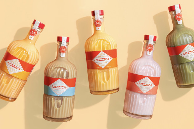
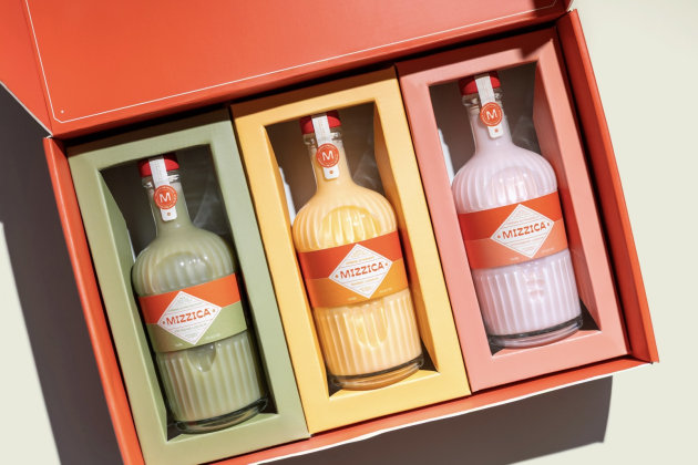
According to Percept, the packaging centres on a minimal wrap-around label and contemporary wordmark designed to anchor the range while allowing flavour and colour accents to differentiate each variant. Strong contrast and a clear visual hierarchy were used to support shelf visibility, while typography was designed to balance brand expression with Australian regulatory requirements.
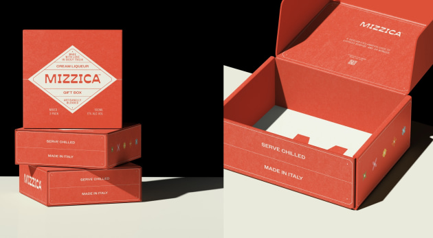
The label, Percept adds, delivers product information and brand storytelling from front to back, and was designed to work across retail shelves, online channels and potential gift formats. Vetroelite supplied the bottles and the labels were printed by Architeam Studio Associato in Italy.
Christal Zamanos, designer at Percept who led this project, said, “The design strategy positions Mizzica as a contemporary expression of Italian celebration. It honours tradition while speaking clearly to the present, allowing flavour and colour to take the lead while the wordmark anchors the range.”
The branding system was designed to work across multiple flavours while maintaining a consistent identity.
Mizzica draws on Sicilian crema liqueur traditions and is positioned as a drink intended to be enjoyed after meals. The branding references Italian lifestyle cues while presenting the product in a format aimed at contemporary consumers.