With pack design, it’s easy to be swept up by the aesthetics – the colours, typography and imagery – but what about what it says? How can it effectively engage consumers to surprise and delight them, not just on a stylistic level, but unleash the power of copywriting. Hulsbosch’s Grace Brown unpacks it all.
In its purest form, design is communication through visuals to convey a message. But, in today’s modern landscape where we are constantly bombarded with new designs around every corner and where sensory overload is the norm, how a packaging design ‘speaks’ plays a bigger role than ever for brands to distinguish themselves and become master storytellers.
Packaging that speaks volumes finds its voice through the art of copywriting – an often-underestimated tool that weaves stories in a compelling and relevant way, which ties the words together with the visuals for brands to connect and engage with their audience.
It creates a 360-degree brand that considers the brand’s purpose and reason to believe by delivering a seamless message and tone of voice.
Strategically, a distinctive tone of voice adds personality and persona, which creates stronger, deeper connections with the consumer, helping that brand to stand apart from its competitors. It adds meaning and context to design – tapping into the brand’s archetype, while building a unique brand image.
Packaging design can harness the power of copywriting in several ways. Statistically, consumers spend only three to five seconds to notice a brand on shelf, but once they pick it up, it’s about the critical ‘brand in the hand’ experience. Utilising every facet of the pack – the front, the back and everything in-between – is so important, because that added attention to detail makes the consumer take pause, reconsider, and takes them on a journey they want to invest in.
Keeping it simple sounds easy, but the real art lies in keeping it engaging. A great way to achieve this is through the use of puns – simple and easy to understand, and if you get it right, it’s beautifully clever and memorable.
Keeping it simply relatable to the consumer is a superpower when it comes to copywriting. Below are examples of three brands that have harnessed this power to elevate their design and brand message.
Plantitude: Reappraising Foods
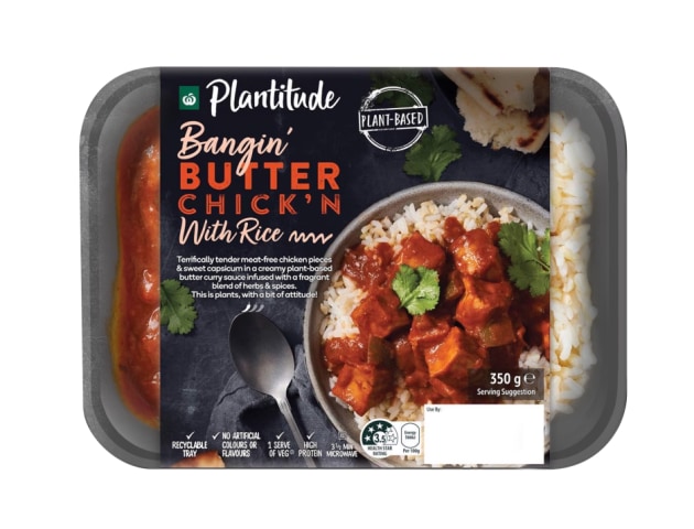
Plantitude celebrates food and indulgence in the vegan category, which traditionally can be seen as a compromise and lack of taste. It offers consumers reassurance, and builds anticipation and excitement that the product is going to perform in taste and quality – it’s not a compromise. The simple variant descriptor ‘bangin’ drives attitude, personality and creates a relatable language that connects with the consumer. Vegan food shouldn’t have to be boring.
Heaps Normal: Changing attitudes
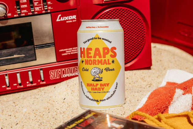
Independent Australian brewery, Heaps Normal, taps into cultural shifts on sobriety, making a statement about attitudes towards drinking and making good choices. The language breaks away from traditional beer credentials – not tough, blokey or contrived – and has created a differentiated message in this space that is modern, inclusive and normalises mindful drinking. ‘Too good to be wasted’ links both to the product and the consumers lifestyle, a clever and simple play on words that packs a punch.
Lady Jayne: Speaking your language
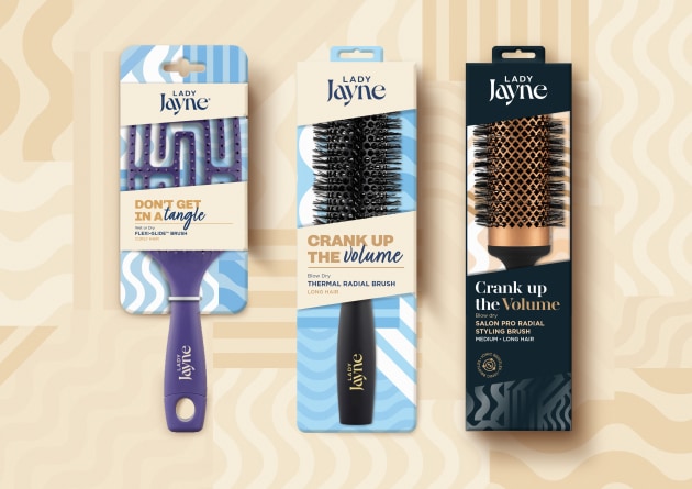
A fresh take for the long-standing hair tools market leader, Lady Jayne, the new redesign taps into inclusive and aspirational product messaging that aids navigation between different products, while connecting to consumers on a personable level. Clever copywriting has turned a functional element into an emotional connection. The core range has a conversational and personable tone that feels real, reliable and trusted, while the Pro range is more direct to communicate its elevated positioning. A strong communication strategy, which creates a brand message that inspires the consumer.
Each of these brands use simple and relatable messaging to connect with their target audience and stand apart in their categories. Whether it’s adding a touch of attitude or challenging conventional norms, their communication on-pack plays a vital role in creating memorable and meaningful brand experiences.
This article was first published in PKN Packaging News November-December 2023 print issue, page 44.