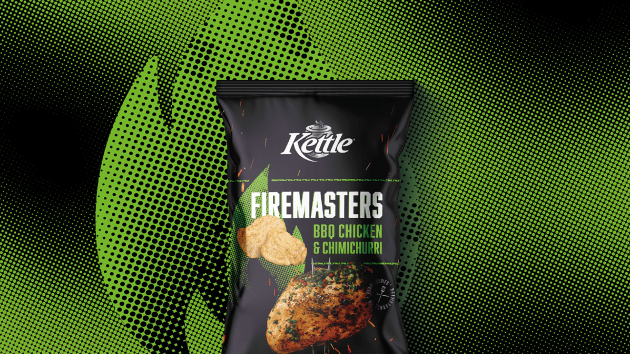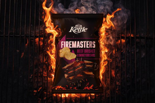
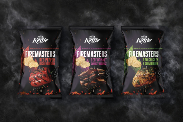
Snackbrands' Kettle Firemasters range brings the drama of open flame cooking to the snack aisle, with a packaging design by Edison that transforms fire from a familiar barbecue cue into a visual marker of craft, control and flavour mastery.
Firemasters is a premium sub range from Kettle, developed by brand owner Snackbrands to "elevate the traditional snacking experience". The range is designed to "appeal to flavour explorers looking for an indulgent, high quality product that feels both primal and refined".
The packaging design, created by The Edison Agency, amplifies this positioning through bold, sensory storytelling. Rather than leaning on expected category tropes, the design reframes fire as a symbol of culinary skill and flavour confidence.
Edison says the deep black background, a core element of the Kettle brand, provides the canvas for glowing embers and sparks that suggest heat, intensity and movement. "The visual language evokes the theatre of open flame cooking, creating depth and intrigue while maintaining a premium, controlled aesthetic," the design studio says.
Typography is described as "confident and purposeful", reinforcing the idea of mastery rather than novelty, while strong appetite appeal helps translate the flavour promise at shelf. Together, these elements encourage shoppers to engage with the pack as an experience, not just a flavour descriptor, according to Edison.
The final packs were produced in collaboration with packaging suppliers Amcor and RollsPack, delivering a high impact result that performs in a competitive snack category.
Pete Dillon contributed photography for the range, while Vicki Valsamis worked on styling.