

A branding and packaging agency designed a solution for Blistex Pearl’s very small pack – with very big constraints.
Blistex is known for its lip balms that protect lips from cold, wind, air conditioning, sun, and cold sores.
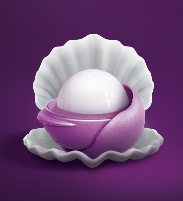
It has innovated in the past, but its newest range of moisturising lip balms, Blistex Pearl, comes in a unique sphere-shaped flip-top package that rotates and stays attached for easy use.
When it came to designing the packaging, designers in each regional market were made responsible for the creative expression of the product while ensuring the packaging design remained in line with the overall master brand global strategy.
Sydney branding and packaging design agency Our Revolution was given the task of presenting the new lip balm in Australia.
Its job was to enhance the product on shelf and show off Blistex Pearl’s unique assets to its audience of women aged 18-40.
The product is housed in a blister hang-pack with a clear plastic front and a dome-shaped blister that traces the product outline.
It came with a number of challenges, according to the company.
The overall packaging format is small, and a large portion was covered by the physical product – but it was vital the design still communicated the key product benefits through imagery and typography.
The packaging also had to stand out clearly and emphasise the uniqueness of the flip-top lid and the new product format.
Thirdly, there were two variants that had to be separated sufficiently, and the different moisturisation benefits for each highlighted, to encourage consumers to try both variants.
Finally, the look and feel of the new product had to sit comfortably within the broader Blistex range.

Our Revolution’s solution was first and foremost to keep the design uncluttered and the information to a minimum.
An arrow on the plastic cover around the outline of the product draws attention to the unique opening of the product within.
The open product is shown above it, inside an oyster-shaped shell which recalls the product name.
And the brand name and “new” are highlighted in red against a blue or lavender background (differentiating the two variants).


