The creative partnership between Sydney-based branding and design studio Squad Ink and crafts spirits distillery Archie Rose Distilling Co. continues to produce high end packaging design that delivers a compelling story on pack.
In its latest collaboration, which brought the work of acclaimed tattoo artist Horisumi (Kian Forreal) into the mix, the companies have developed packaging for a limited edition rare gin series, Archie Rose X Horisumi.
Terry Squadrito, director at Squad Ink, told PKN that the aim in this project was to create packaging that was a true reflection of the individuals who crafted the product and the partnership that formed the unique collaboration.
“The process began with Horisumi’s interpretation of the Japanese four seasons; Archie Rose then expertly crafted a gin range using Horisumi’s art as inspiration. Our role was to bring both worlds together to create a timeless collectable that everyone could be proud of,” Terry Squadrito says.
The first in the series, Autumn, tells the story of the Kiku flower and the autumn gift of the fallen maple leaf.
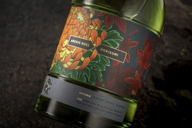
Working with the artist, the Squad Ink team designed a highly graphic label wrapping the full circumference of the belly of the bottle to create strong impact on shelf.
“We used the existing signature Archie Rose bullet style bottle with a heavy-weighted base. The shape inspired by the impressive copper pot stills at Archie Rose," he says.
“The main feature is a 360 degree recessed label indentation across the body which gave us maximum area to show off Horisumi’s incredible artwork. It’s also a useful hand grip area for bar tenders."
The label design incorporates a vibrant use of colour and deep tones aimed to purposely elevate the botanical and rich flavour profile of the gin itself.
“Horisumi created the original artwork with Copic markers on watercolour art paper which was then hi-res scanned," Squadrito explains.
“Being a limited release collaboration product we opted for a large format HP Indigo WS 6600 press which offers more economic MOQ costs without compromising on print quality."
Squad Ink worked with label printer Mulit-color Corporation Australia.
“We chose Multi-color’s latest house stock called Pure Impact which offered the best print clarity and richness of colour.
Pure Impact has a nice course texture which imitates the watercolour paper Horisumi used."
“A gold foil was stamped throughout [on a Digicon Series 2] and then sealed with a matte machine varnish. Our intention was to simplify the design and print processes as much as possible so Horisumi’s art would take the front seat.”
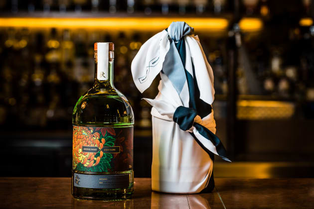
As a final touch, and embracing the Japanese tradition of Furoshiki wrapping, the first 200 bottles of the limited edition gin will be presented in a variable printed synthetic silk cloth featuring the individual bottle number and Autumn kanji.
Squadrito explains: “Tattoo culture in Japan is a little different to here in Australia. In Japan, it is disrespectful to reveal your tattoos in public which is why people never tattoo their faces, necklines or hands.
“We respect this tradition through the Furoshiki wrap which tastefully conceals Horisumi’s art. In Japan, Furoshiki is commonly used to wrap parcels of food or gifts which is quite fitting for this very sharable collectible gin series.”
Commenting on the collaboration, Matthew Squadrito, creative director of Squad Ink, says “Our job was to ensure that the artworks had strong impact on pack as well as clear differentiation between each season.
“It was also our job to deliver a unique and compelling story through the product’s brand identity, ultimately creating an authentic and enduring bond between the brand and the audience”.
Horisumi Autumn is the first in a series of four rare gins to roll out this year, one for each season.