WA's iconic dairy brand Brownes Dairy has rolled out a new masterbrand and packaging refresh across its range, developed by Sydney-based design and branding agency Boxer Brands.
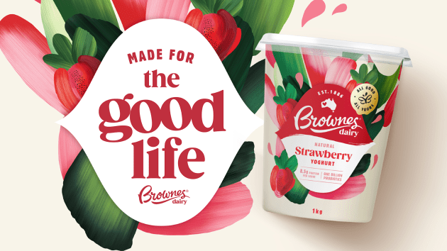
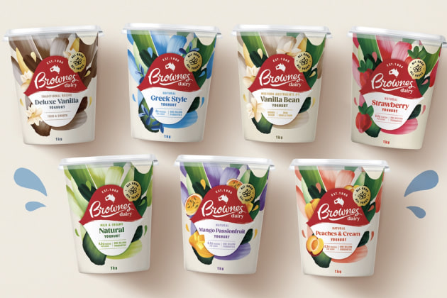
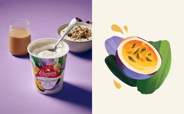
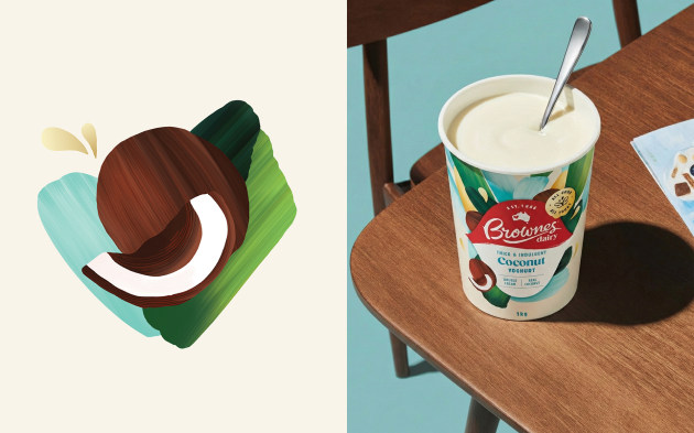
The update includes changes to the Brownes logo, a new butterfly brand mark formed from mirrored “B” letterforms, and a revised packaging system using hand-crafted illustrations, colour and typography across categories including milk and yoghurt.
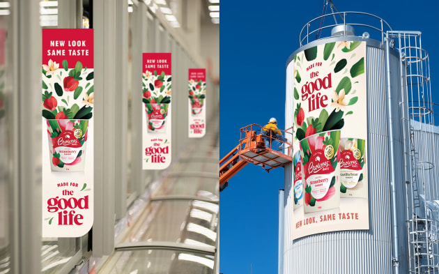
The new packs have started rolling out on shelf, with the visual system also extending across signage, digital touchpoints and fleet livery.
Brownes is Western Australia’s oldest dairy and the brief was to evolve the masterbrand and packaging system to reflect this legacy while ensuring the brand felt as “contemporary, fresh and energetic as the products themselves”.
Commenting on Boxer's execution of the brief, Lily Ash, group account director at Boxer, said the work was about evolving the brand while retaining its connection to Western Australia. “Brownes has such strong roots in Australian life. This refresh was about capturing that unmistakable joy of great dairy, elevating the design while keeping it approachable, vibrant and true to Brownes’ WA spirit,” Ash said.
The design system is built around what Boxer refers to as “The Ripple Effect”, a concept the agency says informed the illustration, layout and logo refinement. Tim Meredith, design director at Boxer, said the idea guided the overall visual direction.
“The Ripple Effect became our north star. It speaks to growth, nourishment and the ripple of joy Brownes creates in people’s lives. That sense of upward energy guided everything from the illustration direction to the logo refinement,” Meredith said.
At the centre of the refresh is a refined Brownes logo, alongside a newly created butterfly symbol carrying the line “All Good. All Yours.” Illustrations used across the range were created by Jordan Lee, a member of Boxer’s team.
The project marks the third major yoghurt portfolio refresh delivered by Boxer for Brownes and follows a 12-year working relationship between the two companies. Gwen Blake, founding director at Boxer, said the length of the partnership enabled continuity in the brand’s evolution.
“We’ve been lucky enough to partner with Natalie Sarich-Dayton and the team at Brownes for over 12 years. It’s one of Western Australia’s most iconic dairy brands, and together we’ve evolved it through multiple chapters, each one strengthening its distinct, joyful personality. That kind of long-term collaboration is what allows truly meaningful design to take shape,” Blake said.
Nicole Ohm, head of marketing at Brownes Dairy, said the refreshed system would support the brand over the longer term. “Boxer delivered a solution that's not only visually beautiful but strategically powerful, with a framework that will serve us for years to come. Working together for so many years, means Boxer has an intuitive ability to catch our dream. We are delighted with the resulting design solution that is both uplifting and commercially impactful,” she said.
Brownes Dairy was established 140 years ago and is based in Western Australia.