Packaging plays a central role in Brownes Dairy’s launch of Füll+, a high-protein liquid meal positioned as a challenger to traditional fast food. Design by Boxer Brands, bottles by Visy, Label by Labelmakers WA.
Rather than competing head-on in the established sports nutrition space, Füll+ has been designed – structurally and visually – to reframe the product beyond protein shakes and create a "new mental category" in the chilled dairy aisle.
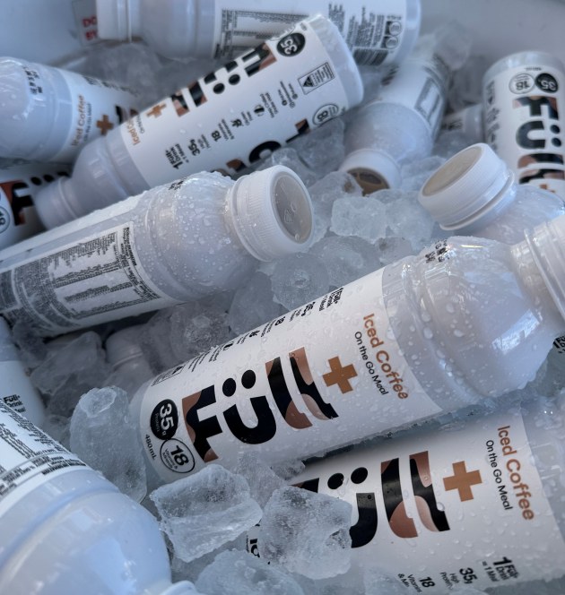
The product is delivered in an opaque white PET bottle, supplied by Visy, and selected to protect its light-sensitive vitamin and mineral blend. The matt paper-based pressure sensitive label is supplied by Labelmakers WA.
According to Brownes, the barrier properties of the material are critical to maintaining product quality and shelf life during chilled distribution and on-shelf display.
That functional requirement also became a defining brand asset.
Designing beyond sports nutrition
The visual identity, developed by Boxer Brands, deliberately rejects the dark, aggressive cues that dominate the ready-to-drink protein category.
“We weren’t trying to compete in the existing protein space,” says Gwen Blake, founding director of Boxer Brands. “The identity needed to feel modern, efficient and purposeful – not sporty or supplement-driven.”
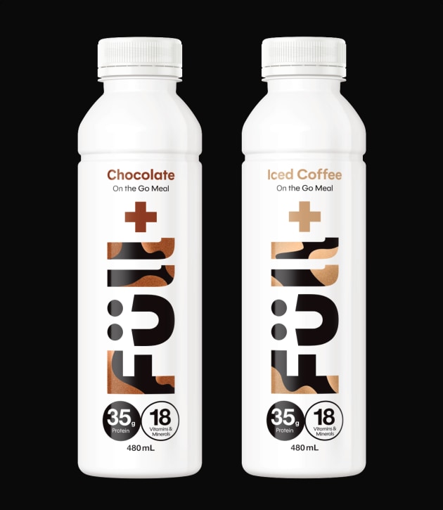
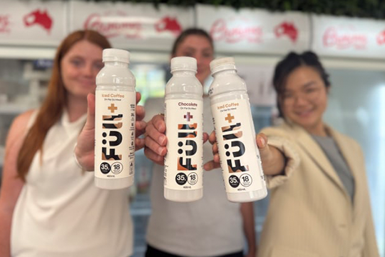
The white bottle creates immediate shelf contrast, while the bold vertical FÜLL wordmark and prominent “+” symbol are intended to communicate completeness and precision. The umlaut subtly forms a smile, adding warmth and signalling that the brand is for everyday consumers, not just gym-focused users.
Minimalism was intentional.
“Rather than overwhelming the pack with claims, we structured the information for fast comprehension,” Blake explains.
With 35g of protein, 18 vitamins and minerals, and more than 5g of fibre, Füll+ carries significant nutritional messaging. On pack, however, those credentials are delivered through simplified graphic devices designed to feel confident rather than clinical.
The hierarchy places “On the Go Meal” front and centre, reframing the product from protein shake to sustenance.
Shelf strategy in chilled dairy
The RTD protein aisle is typically dense and visually noisy. By contrast, Füll+ adopts a bright, stripped-back aesthetic.
“The clean white bottle creates immediate contrast at shelf,” Blake says. “The oversized vertical wordmark acts as a strong brand block visible from distance.”
Merchandised in the chilled milk section of Coles nationally, the pack sits alongside traditional dairy beverages rather than within ambient supplement ranges. That placement reinforces Brownes’ ambition to reposition the dairy aisle as a viable alternative to the drive-through for time-poor consumers seeking convenience without compromise.
From a packaging standpoint, the bottle therefore performs a dual function. It provides light protection for a nutrient-sensitive formulation while serving as the primary mechanism for category disruption.
As retailers continue expanding chilled, functional “grab-and-go” formats, the alignment between formulation science, material selection and visual identity becomes increasingly critical.
In the case of Füll+, packaging is not simply a container – it is the vehicle through which Brownes signals a new kind of fast food, anchored in dairy and delivered through disciplined, minimalist design.