

A new financial year has begun. There will be new packaging breakthroughs. The need to be sustainable and standout will continue to nag manufacturers, packaging companies and designers, provoking change. The courageous, savvy and nimble will have an impact and be rewarded.
PKN would like to reward the courageous, savvy and nimble of 2013-14 in Australia and New Zealand. These are PKN's Packs of the Year.
Tea Amo
Design Company: Founded by Design
Designer: Chris Thomas
Client: Danielli's Fine Foods
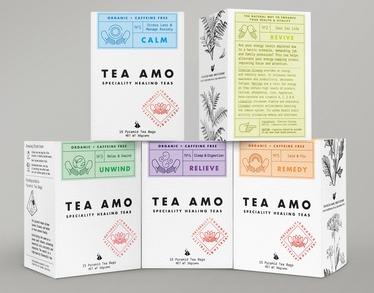
Specialty supermarkets and whole food grocers fill a lot of shelf space with local and overseas tea brands. Packaging tends to be aesthetically appealing and eye-catching across the entire genre. Founded by Design had a difficult task to conquer - to create branding and packaging for a new brand in a saturated market. So, it launched Tea Amo as an appealing alternative to medicinal treatments. Using 'healing hands' for the logo and across the whole brand language reinforced the idea of care and quality. This was combined with a unique visual style that straddled medicine and premium tea.
The Whistling Chef
Design company: in house
Designer Annie Martin

Ready meals exist because feeding the family is not just about little bodies with enough nutrients to thrive. The Whistling Chef understands that when mum has compromised, hand drawn images say home made. That childlike design says kid-friendly. And a whistle when it's ready pack (technology by MicVac) is the next stage version of flying aeroplane spoons. On top of all that, this pack says “Hello there, look at me,” in the supermarket fridge, in a crowd of competitors that too often forget the magnetism of a friendly personality.
5 Rounds Shiraz
Design company: Watts Design
Designer: Peter Watts
Client: Water Wheel Vineyards

The average wine explorer doesn't really respond to 'echoes', 'evokes' and 'references'. He/she is scanning a cacophany of competing shapes and colours on a densely populated shelf for something that catches his eye and then holds his interest. That's what Peter Watts has achieved – attention grabbing, noticeably different, illustrated labels that tell a real life story from behind the scenes of the brand, that he might even read and like.
Pepperjack
Design company: The Collective
Client: Treasury Wine Estates

There are tens of thousands of red wines. Pepperjack stands on a quirky marketing trick. Each wine in the range is crafted for a cut of steak. The Collective turned a marketing trick into a viable point of difference. Along the way it added the desirable elements of sophistication, intrigue and brand story. The angled label 'came with' the brand, but The Collective made it wrap around the bottles: When you have a detailed story to tell on a label, you need to make people curious enough to read it.
Prodjuice Cold Pressed Juices
Design company: Folke Army
Client: Prodjuice

Unprocessed juices settle into layers on standing. Even ardent back-to-nature brands ignore it. The Folke Army used it as the basis of its packaging and pack design – communicating the most compelling reason for drinking Prodjuice in a striking way and gaining distinctiveness. The layering is used as a graphic device to describe the juices' ingredients and their proportions. The minimalistic design underlines each products' purity and the brand suggests ways for the glass bottles to be repurposed, which underscores the environmentally responsible ethos of the brand.
Zamora salami
Agency: Bardo
Client: Zamora Homemade
[image above]
You are selling a log of dried meat. In this case, you are selling a log of specialty dried meat - Fiordland venison, for example. Zamora is an avant-garde 'designer' food brand in New Zealand, with homemade in its brand name. Bardo wrapped the salamis like bonbons – an avant-garde, designer idea with homemade in its DNA. The elegant black and white graphics add appeal. The concept is inherently standout – no one else is doing it.

