

Nestlé has unveiled a complete redesign of the Uncle Tobys core ready-to-eat cereal range – the first coordinated packaging change in two decades – with a new look set to roll out in stores from September.

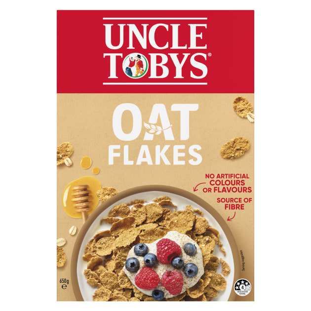
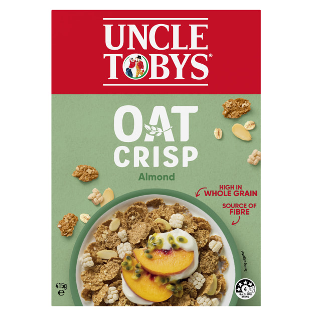
The Uncle Tobys ready-to-eat cereal (RTEC) packaging refresh spans five household favourites – Oat Crisp, Weeties, Oat Flakes, Shredded Wheat and Fruity Bites – uniting them under a strengthened Uncle Tobys masterbrand architecture while updating the design to improve shelf navigation and highlight key nutritional benefits for consumers.
Nestlé CPW marketing manager for RTEC, Akash Ramesh, tells PKN the change was driven by a need to make Uncle Tobys’ presence in the cereal aisle distinctive and compelling.
“We realised that while we have diverse products in the range, we are one brand, so why aren’t we calling that out more?” Ramesh says. “Our shoppers enter a fragmented cereal aisle, so making navigation easier, while building on the strong equity Uncle Tobys already has, was key. We wanted to enhance shopability without alienating loyal consumers.”
Balancing heritage with a modern edge
The new design retains the brand’s iconic red masterbrand panel while introducing cleaner typography, modern pack layouts and consistent navigation cues. Nutritional call-outs such as ‘High in Wholegrain’ and ‘Source of Fibre’, along with the Health Star Rating, are standardised across the range for faster decision-making at shelf.
“Uncle Tobys is woven into the fabric of Australian breakfast habits,” Ramesh says. “It was essential to modernise without disrupting the trust and familiarity people have with these products.”
Brand and packaging design specialist Edison Agency, which has partnered with Nestlé CPW for many years, led the creative execution. CEO Amber Bonney said the project was about more than a facelift.
“By leading with a masterbrand architecture strategy and sharpening Uncle Tobys’ most powerful brand code, we’ve created a cohesive, modern system that applies behavioural science principles to boost shopper navigation,” Bonney said. “The result is a harmonious family of iconic products that celebrate their distinct legacy with renewed confidence and clarity.”
Shopper research at the core
Consumer and shopper insights shaped every stage of the redesign. Ramesh explains that Nestlé tested concepts for brand blocking, visual recognition, and clarity of benefit messaging through qualitative and quantitative research, setting “action standards” that had to outperform current packs before moving forward.
Retailers were engaged early in the process to ensure the new look would integrate smoothly into planograms and deliver a stronger category story.
Execution and measurement
The redesign has been two years in the making, from the initial decision to unify the portfolio under the masterbrand to final validation and production.
Key metrics for measuring success will include brand health indicators such as recognition, trust and preference; on-shelf visibility and navigation scores; sales and rate of sale; and repeat purchase rates. Consumer feedback and retailer responses will also be monitored closely.
While Ramesh says the redesign is intended as a long-term platform for the range, Nestlé will remain responsive to consumer input.
“We want this to be sustainable and effective for the long term, but if the data shows we need to adapt, we will,” he said.
The new packaging will begin appearing on shelves from September, with a full rollout expected in the following months.
This article was first published the September/October issue of PKN Packaging News, page 22.


