Nestle, Lovekins and Cutri Fruit all have one thing in common, and that is leaning on their packaging to deliver brand messaging to their customers. At the 2021 Australian Institute of Packaging (AIP) Australasian Packaging virtual mini conference this week, each explained how.

During Day 1 of the conference, attendees were treated to the stories of how the aforementioned brand owners have turned to packaging as a driver for their messaging, whatever that message might be.
“From the use of renewable materials, to on-pack interactive consumer engagement, and changing branding of a pack to push recyclability – these are just some of the ways they are leading the way in their categories,” said Ralph Moyle, education coordinator, AIP, who moderated the session.
CONVEYING ORIGINS & IDEALS
Lovekins, specialists in baby and feminine hygiene and home care, focuses on growing an ethical business by supporting local communities, sustainable farming, and product education.
By 2025, Lovekins’ goal is to incorporate more sustainable, eco-friendly and biodegradable materials through raw, indigenous ingredients.
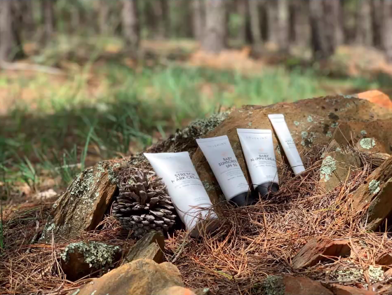
On its journey to find a sustainable alternative for its packaging, Lovekins crossed paths with Impact International and was introduced to its SARAH tube, which is sustainable, FDA-approved, and protected with internationally registered anti-counterfeiting measures.

“With the new tube, not only did it meet our social corporate responsibility in terms of renewable materials and recyclability, but also ticked the mark with product protection with counterfeiting,” said Amanda Essery, founder of Lovekins
“We encourage brands to think about how you are making your packaging, to make it with minimal footprint, make it so it is recyclable, but also to make sure to communicate the circularity of its products to customers,” explained Aleks Lajovic, managing director at Impact International.
Once Lovekins moved over to the new SARAH tubes, it also undertook a pack redesign to better convey to its customers exactly what the brand stood for.
Lovekins changed to a clean white matte tube to signify the purity of a newborn child, and contrasted it with the black text and cap to represent the Indigenous Australian culture.
“With our hero logo we also incorporated a peach colour, in which we combined yellow for the sun and red for the earth. All these colours – black, yellow and red – are all representative of the colours that make up the Aboriginal flag,” Essery continued.
“So, when you look at this packaging, it is not just a new design, there has been a lot of thought put into it – it is not just a product that is sustainable and eco-friendly with clean and green ingredients, but that packaging outside also tells a story about our brand.
“Our strong Australian ethos in branding is what we want to be internationally recognised for. Our belief is that a strong brand stays true to its origin.”
KNOWLEDGE IS KEY TO RECYCLING
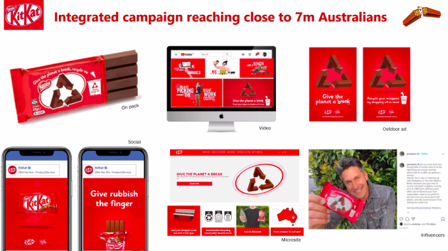
Nestle, via its brand KitKat, has been undertaking its ‘Give the planet a break’ campaign, which aims to clarify and simplify soft plastic recycling for its customers.
The company found that although 80 per cent of Australians state they are concerned about recycling, around 48 per cent of people are getting recycling wrong, while only 10 per cent of the population are recycling soft plastics correctly.
“Despite the general confusion around recycling, the positive takeaway was the fact that everyone had good intentions in regards to recycling, but the reality is close to half of the country are doing it all wrong,” said Joyce Tan, head of marketing, Confectionery, Nestle.

“The intent of this campaign was to really motivate people to make the right choice and recycle their soft plastics, including our KitKat wrappers, correctly.”
The company had a few key messages that it wanted to communicate through this campaign, most importantly, for everyone to do better with soft plastic recycling.
“We took away our cute cat logo and snapping finger and we configured a recycling logo in the scheme of our KitKat snapping finger,” Tan said.
“We also really wanted to communicate clearly on the front of the pack to encourage customers to recycle and drop their wrappers off in store. There is also information on the back of the pack [accessed] through a QR code.
“By scanning the code, customers will be taken to a microsite where they can get further information around what soft plastics are, how to properly recycle them, where they can find a REDcycle bin near them, as well as what happens to them after the recycling process.
“Consumer comprehension is really important, especially for people who don’t know a lot about soft plastics and recycling. It is important to educate them on how.”
PACKAGING AS MARKETING
Cutri Fruit, part of the LaManna Premier Group and grower of premium quality stone fruit, looked at its packaging as a tool for marketing and created an intuitive and interactive pack for its Galaxy Fruits range.
In partnership with NAVI Co Global, Cutri Fruit “found [itself] in the galaxy and delivered an out-of-this-world design” for its packaging to stand out on shelves.
“In our marketing mix, we really wanted to make sure we were presenting the right message, at the right time, at the right place, and this is where packaging played a really extensive part in our marketing campaign,” explained Anika Dobbie, marketing manager at La Manna Premier Group.
“We made sure that our packaging was a complete marketing tool in itself – making sure that it was educational, that it was fun, and that it really spoke to our audience.”

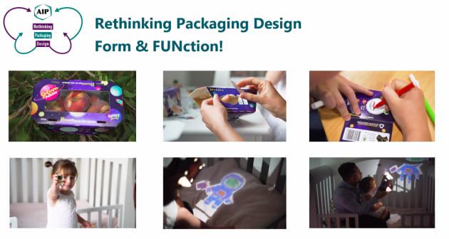
For its multi-purpose packaging, Cutri Fruit used bright colours and graphics, and highlighted the unique Saturn-like shape of the peaches.
Cutri also incorporated pop-out collectable colouring-in figurines, which when constructed can be used to create image projections (see below) and thus can be reused over and over again. This provided an activity for kids, while the 16 different variants encouraged repeat purchase, while bumping up the sustainability of its packaging.
“What we really wanted to accomplish was to put some smarts around the packaging, and make it so that people will want to hold on to the packaging instead of recycling it, which of course they are also able to do,” said Gilad Sadan, managing director at NAVI Co.
“We took a very consumer-centric approach to our design that was both fun and functional, and also referred to the 2025 Packaging Targets for the fundamental basics for the pack, including using sustainable packaging guidelines.
“We also created an avenue on the packaging to communicate to consumers how they should handle it and dispose of it, and even put a QR code to link between the physical assets and the online assets in order to help further educate consumers.”
The new packaging also helped to open up some new markets for Cutri Fruit to play in.
“Some markets that weren’t interested in the product at first turned around because of the packaging, simply because now, aside from providing a healthy snack, can also be used as an educational tool,” Dobbie concluded.
The 2021 AIP Australasian Packaging mini conference was held on 17-18 August and showcased best-practice and award-winning packaging designs that have been recognised at the Australasian Packaging Innovation & Design Awards (PIDAs).
The Women in Packaging Forum, run by PKN Packaging News and Food & Drink Business, in partnership with the AIP, was also held on 18 August. Click here for coverage on the keynote and the panel conversation.